Here at Raka, we recently revisited our style and copy guide, making updates and ensuring it was clear, concise, and easy for everyone to access when they have a question about branding, tone, or the Oxford comma.
Throughout the process, the Raka design team looked at style guides from a wide range of brands to see how they were presented, not just through logos, colors, or fonts, but how the style guide itself represented the company. After looking at a number of style guides for inspiration, Art Director Leigh Pazolt, Senior Designer Charlie Howell, and Designer Taylor McKenzie put together a list that represents both standard bearers of style and visual innovators.
Whether you’re looking to overhaul your company’s branding or are giving your style guide a quick refresh, these five style guide examples are sure to get your creativity flowing.
Table of Contents
What every style guide needs
Your company’s style guide should be a representation of your brand, both visually and in the words you use for conveying your message. Where the copy style guide provides the rules for grammar, proper use of industry terms, and how to speak about your company both internally and externally, the visual style guide offers the “rules” for how your brand should look, both online and in print media.
Before we dive into the inspirational style guides, let’s review the basics every style guide should include:
- Brand logo — Include all variations and color options of your company’s logo.
- Brand colors — Include the company’s color palette and specific colors.
- Typography — The fonts you use (don’t forget to include a web font).
- Social branding and photography — Document the look and feel of your social media accounts and the photos that go with them.
Even if your company is planning to put together a lean-and-mean style guide with just the basics, these four elements are essential to ensure all visual aspects of your marketing are aligned.

As you think about what to include, it’s also important to consider how to present the guide, as well. These inspirational style guides all excel in presentation, so if you like geeking out to design like we do, make sure to take a quick spin through all of them.
Scrimshaw Coffee
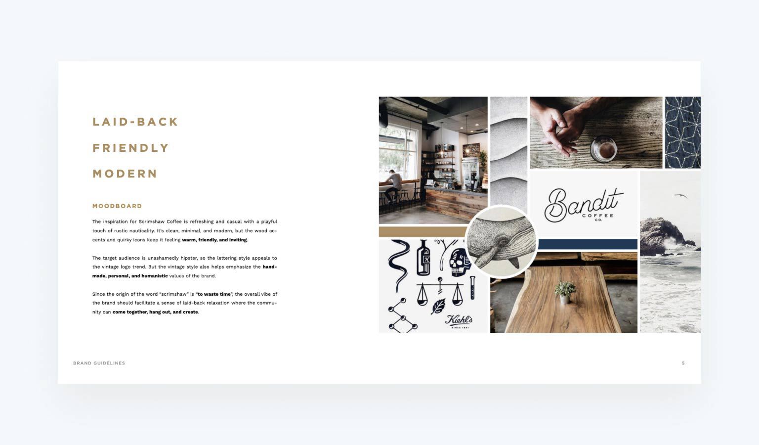
Taylor selected boutique coffee retailers Scrimshaw Coffee to demonstrate how even small companies can have a thoughtful design guide that shows off a modern and appealing style.
“It’s simple, clean, and effective,” she said. “I appreciate that they show so many secondary logos. They are very on-trend right now.”
In addition to these secondary logos, Scrimshaw Coffee does something a lot of brands choose to do in their style guides—make clear the unacceptable uses of the logo. Showing the dos and don’ts of your brand helps employees maintain quality control.
But what’s most noticeable about this style guide is how important tone and mood are to this brand. On page four, you’ll find the company’s design “mood board” with inspiration and a succinct description of the tone and target audience, setting clear expectations for the employees who will use this guide.
Barnes & Noble
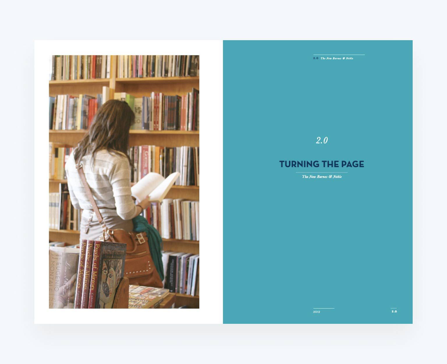
Let’s be honest. Many companies only dust off their style guide when undergoing a rebrand. If that’s the position you’re in, take a look at the Barnes & Noble style guide. Charlie selected this guide because it provides such a good example of a rebranding doc.
This well-known bookseller is all about the printed word, so the company smartly designed its style guide to look like a book, with a title page, table of contents, and preface. In addition to logos, fonts, and letterhead is an explanation of the thought behind these designs in the company rebrand. The theme, “turning the page” is consistent throughout, sending the message to all at the company that the rebrand is something leadership takes seriously and that consistent adoption is a priority.
HubSpot
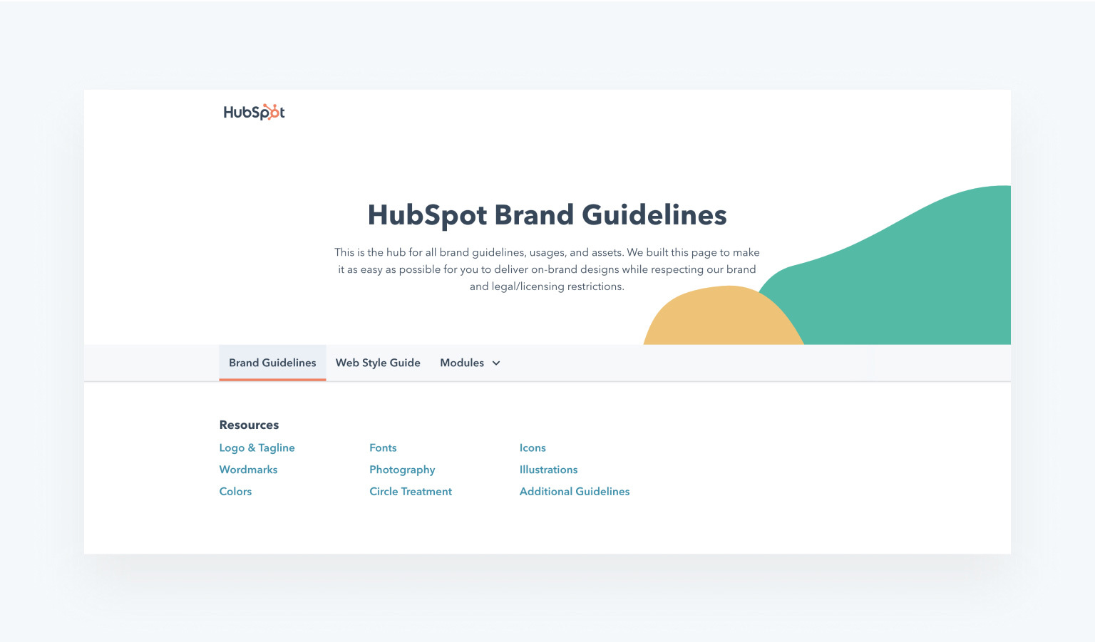
These guides may be aspirational, but not every stellar guide needs to get into the nitty gritty of design details. Leigh picked HubSpot’s style guide for its digital simplicity.
“Some guides can really get into the fine details which may not be necessary for everyone,” said Leigh. “This covers the high level things that a digital marketing team should know. It’s practical.”
Because HubSpot’s brand is so deeply rooted in digital tools, the company provides great insights and details on how to present the company online, from CTA design to website modules. It’s something for brands to consider during and website refresh—will buttons be square or rounded? Will CTA’s be centered or left-justified? HubSpot took the opportunity to document its preferences because it was important to the brand. Consider doing the same if your brand’s online identity is a priority.
Audi

It’s hard to beat the styling of a luxury car brand, but that’s not the only reason Charlie chose Audi’s style guide as an inspirational example.
“This is a very detailed brand guideline,” said Charlie. “Also, it’s cool that it’s built out as a website instead of just a doc.”
Having your company’s style guide available online, either on Google Drive or as its own web page, is an easy way to ensure ease of use. If your copywriters and junior designers are constantly having to ask, “Can you remind me where the style guide is stored on the server?” it wastes time and increases the likelihood they won’t even bother looking it up next time, putting brand consistency at risk.
Audi’s style guide is sleek, cool, and comprehensive almost to a ridiculous level. It’s also easy for everyone at this international company to access from anywhere.
Medium
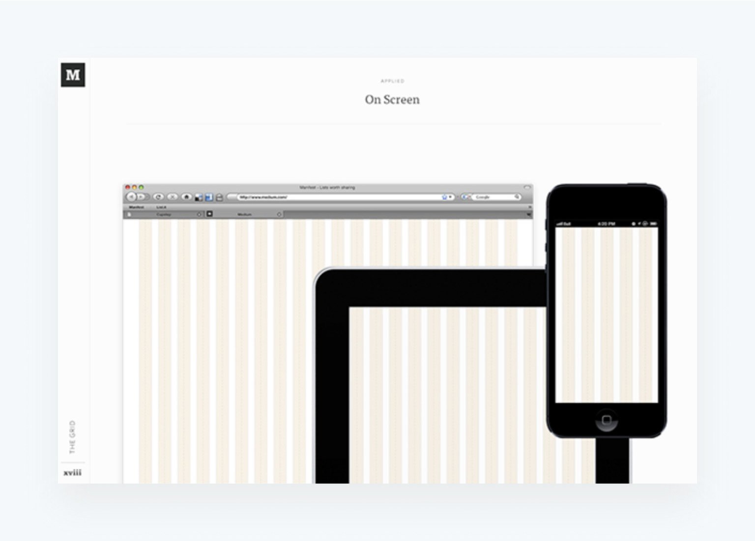
This blogging platform allows users endless options for designing and customizing their pages, yet maintains a clear and clean style for its own brand designs. Taylor chose this guide because it’s both comprehensive and easily digestible with its inclusion of a grid design.
What makes the Medium guide especially modern are the various design elements shown on dark backgrounds. It’s clear to designers and developers how the website should look in dark mode—an increasingly popular way of viewing content online.
Now that you’ve seen some of our favorite aspirational style guides, we hope you’re inspired to dive into creating or updating your company’s own style guide. Of course, if you need help updating your guide, or even starting a guide for a new brand, you can use our style guide template.
Even if you want to keep your guide to the basics, there’s still plenty of best practices to takeaway from these style guide examples listed above. By giving clear direction and highlighting how to use logos, fonts, and imagery in the places your company uses them the most, you’re already on the path to consistent branding.