I don’t read my friend’s blog. It’s not that he doesn’t produce interesting, useful, truly valuable content. It’s not that he forgets to share his posts on social media, or even that he doesn’t use engaging titles. He does all of that.
I don’t read my friend’s blog because just looking at a post gives me anxiety. Every page feels daunting, like a challenge to overcome.
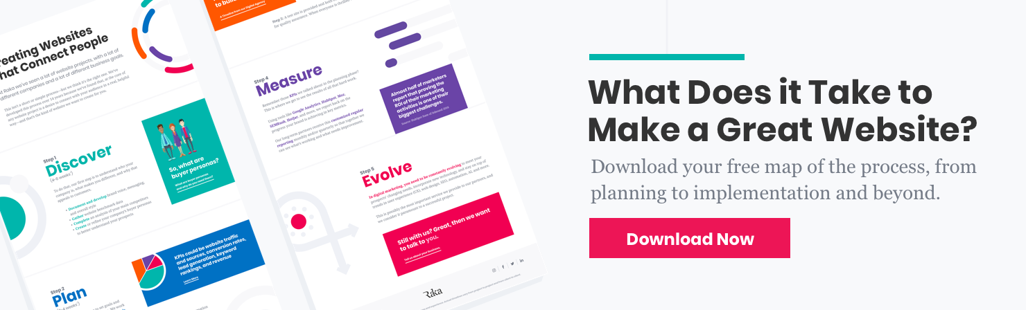
As a web content writer, one of the biggest and most frequent mistakes I see is also one of the easiest to remedy: formatting for readability.
Why formatting is so important
It’s common knowledge that people read differently on the web. Consider your own browsing habits. You click a headline that sounds enticing, scan the post for the specific information you’re interested in, then look for bite-sized takeaways.
You don’t bother reading long blocks of text to isolate the most relevant details, and you don’t like having to search an entire page to locate a particular element.
The posts you prefer to read are formatted to provide you with the most important information as quickly and easily as possible. Your readers expect the same thing.
It makes no difference how interesting your content is. If it’s not formatted for readability, your audience will not read it.
10 web content writing tips to boost readership
So how can you format your content to optimize readability for the web? Keep the following elements in mind as you upload your next blog post.
1. Keep paragraphs short and sweet
Seriously. This might be the most important tip I have to offer. If you take only one thing away from this post take this: paragraphs on the web should be no more than four lines.
2. Size up your font
Tiny fonts not only look old-school, they also immediately make your piece less readable. We spend enough time squinting at our computer screens. Don’t make your users struggle to read your content. Use at least a 14pt text; and don’t be afraid to go even bigger.
3. Use descriptive subheads
What is this paragraph about? I’ll be more likely to read it if I know right off the bat. Wherever you can, include descriptive subheads that act as titles for each section. This lets you coax readers through the post from beginning to end.
4. Plan for mobile
If you think a paragraph looks dense on your laptop monitor, just imagine how it will look compressed for a mobile device. If you have a responsive website, test how it’ll display in a preview by dragging the right side of your browser toward the left to mimic the stacking effect of responsive design.
5. Use bulleted or numbered lists
Don’t be afraid to go ham with bulleted or numbered lists: nothing makes content more easily digestible. Use these for the most important facts or takeaways, just be sure to frame them with descriptive content to give context to “skimmers.”
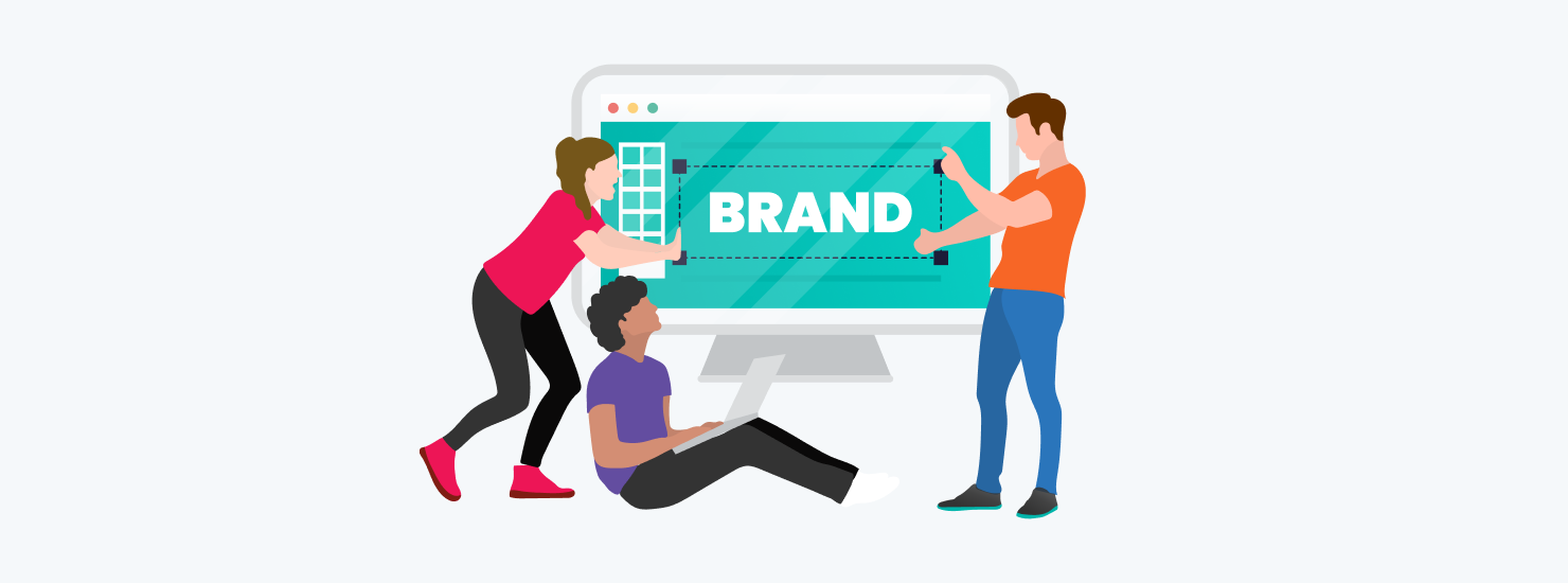
6. Break up your content with images
Like descriptive subheads, images are a great way to break up a post into distinct sections. They also make your content appear less daunting at first glance because there are fewer solid blocks of text.
7. Take advantage of white space
Give your content room to breathe. Include space above your sub-headers and below each paragraph. Consider the spacious feel of Medium’s platform to really appreciate the value of white space.
8. Start with the most important information
Putting your most important information first is essential. This is an old journalist’s trick that’s incredibly relevant on the web, where attention spans are shorter than ever. Don’t make users dig around to find what’s promised in the headline.
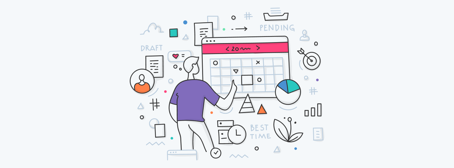
9. Consider jump links
Got a ton of content on one page? Consider jump links, which let users click a link to “jump” to another section on the page. This is a great tool for organizing resource pages like our always-up-to-date guide to social media images sizes.
10. Bold or highlight the most important text
Finally, think back to your school days. Highlighting the main points in bold makes it easy for users to identify key takeaways at a glance.
The truth is, you can’t change the way people read on the web. Don’t fool yourself into thinking that your content will be the exception. It won’t.
What you can do is adapt the formatting of your content to your readers’ habits to make it as painless (and perhaps even… fun!) as possible to absorb your message. Because sometimes it’s not what you say, but how you say it.