So much of what we do for inbound marketing is to drive people to a website. There’s search engine optimization, social media marketing, email campaigns, even digital advertising—they’re all working hard to get people to your website. Once there, you make the pitch that will ultimately convert them to a customer. With all this effort going into driving traffic, your website must be crystal clear about what actions you want visitors to take. That’s where your website CTAs come in.
What is a CTA and what role does it play on my website?
Calls-to-action (CTAs) are the little asks sprinkled throughout your site to entice your visitors to learn more, sign up, get in touch, or buy now. They can be a button, hyperlinked text, a pop-up, or a form. Whatever the shape, color, or size of your website CTA, it’s only function is to get people to click it. It’s how you convert prospects into leads, and move leads along the sales pipeline to a closed sale. In digital marketing, CTAs are kind of a big deal.
Unfortunately, CTAs can also be a huge source of frustration. The difference in performance between two seemingly identical buttons might seem completely arbitrary at first glance. Other times the difference in color, placement on the page, or messaging will increase conversions enough for you to want to make the same change across the entire website.
In this post, we’ll take a look at some proven CTA tactics that have shown to increase conversions and how you can implement them on your site.
Table of contents
- Website CTAs: the guideposts for the buyer’s journey
- The function of your CTAs
- CTAs must stand out
- CTAs must be easy to find
- CTAs must be action driven
- When it comes to website CTAs, less is more
- Testing what works
Website CTAs: the guideposts for the buyer’s journey
Before we dive into tactics, let’s talk about the various reasons potential customers visit your site. Some might be in the fact-finding phase and read a blog post providing advice about their problem. Another might know what she’s looking for and come to your site to whittle down her choices. Other users have already made their decision and are ready to buy, and want to quickly find the path to sale on your homepage.
A study by Rakuten Marketing revealed that consumers visit a company’s website nine times before heading there to make a purchase. Your CTAs should provide paths for the first, fifth, and final time a person visits.

The function of your CTAs
We all know CTAs are for generating leads, but let’s look at how various website CTAs are used. According to HubSpot, there are eight different types of calls-to-action you should include on your website.
- Lead generation – This asks users to trade personal information for a valuable piece of content like a downloadable guide, to view a webinar, or another piece of content that helps solve their problem. You can then take this information and use it to market to them further with a nurturing campaign.
- Form submissions – Use forms on your site that capture name, email, phone number, and other relevant information.
- Read more – For those earlier in the buyer’s journey, they are looking for information to help solve their problem and ultimately what solution to buy. “Read more” moves them along this part of the journey.
- Product or service discovery – What is it you sell? How does it work? How much does it cost? These CTAs prompt the user to learn more or offer a demo.
- Social sharing – What’s more low-pressure than asking a user to share content on their social media channels? These CTAs ask people to spread the word about great products, services, or content with just a quick click.
- Lead nurturing – This CTA offers something free to entice a lead to take the final step in the buyer’s journey. This could include a demo, a free trial, or free quote.
- Closing the sale – Sometimes you want the lead to call the sales team for a chat. This CTA allows the user to contact sales directly and if aligned with a calendar app, can make it easy to book an appointment.
- Event promotion – Got a virtual workshop on your product? Use CTAs to drive people to sign up.
Think about who is reading each page of your site, if the page is meant for people early or late in the buyer’s journey, if you are using the right type of call-to-action on the page, and if these asks are clear.
CTAs must stand out
We’ve all heard the saying, “If you don’t ask, you don’t get.” But what if your ask is hard to read, is buried at the bottom of the page, or is so small it’s barely noticeable?
Calls-to-action must stand out from the rest of your webpage. No one wants to have a flurry of bright colors, flashing buttons, or intrusive pop-ups on their site, but you must also resist the urge to create CTAs that are so unobtrusive they go unnoticed. Here are some best practices you should be using for your website CTAs.
- CTA buttons and text should look clickable.
- Button copy should be short and compelling.
- Use a high-contrast color for the button or hyperlink text.
- Draw the eye by surrounding the button with lots of whitespace (or open space).
Here are some similar products that present the same CTA in different ways. The first is Birchbox, a beauty subscription service that sends busy women sample-sized beauty products to try each month and later purchase full sizes if they like them. This CTA is certainly eye-catching, but it’s not fully clear what the visitor might be signing up for and the images and colors take the eye away from the button—the one thing you want people to be drawn to.
 By contrast, look at Ipsy, another beauty sample subscription service, and the clean and clear CTA at the top of its website. It shows visually and in the copy exactly what you’re going to get, how much it costs, and if you’re interested, how to get started.

CTAs must be easy to find
We all want people to read every word and scroll the entire homepage of our website, but that’s just not how people read online. Research firm the Nielsen Norman Group found that people read web pages in an F-shaped pattern, scanning across full lines at the top of the page, then scanning the first few subheadings, and finally scanning more quickly down the left-hand side of the page. The first lines of the page and the first few words of subsequent lines get the most attention.
HubSpot analyzed how website CTA placement affects conversions by looking at their blog CTAs placed at the bottom of posts. It found that they contributed to only 6% of the blog’s leads. On the other hand, 47% to 93% of post leads came from anchor text links—a standalone line of text linked to a landing page. HubSpot also styled the text as an H3 or an H4 to make it stand out.
Knowing how people read online and how footer CTAs perform, it doesn’t make much sense to leave important CTAs until the bottom of the page where they will, at best, get quickly scanned. It can be frustrating for users and bad for conversions.

One example of this is Bespoke Post, a subscription that sends a personalized mix of unique products targeted toward stylish men. There’s no CTA on this homepage until the very bottom, leaving opportunities to capture buyers on the table.
CTAs must be action driven
Seems kind of obvious that a call-to-action is meant to inspire action, but there are a lot of weak CTAs out there. Take a look at your own site. How do you prompt users to take the next step? Is every CTA asking them to “Learn More”? Here are some quick fixes that can add urgency and inspire action in your CTAs.
- Punch up the copy using short action words, such as “get,” “see,” and “buy now.”
- Show the reader that taking the action will deliver on what they’re looking for, such as, “download now,” or “get tips,” or “take the tour.”
- Make the language user-focused using second-person pronouns. Do use “get your offer.”
- Don’t use company-focused language in the first person. “Download our offer” or “read our guide.”
- Address the user’s hesitation by using reassuring words like, “free,” “no hassle,” and “available anytime.”
When it comes to website CTAs, less is more
One of the cardinal rules of building a landing page is that you want to strip as many distractions away as possible, helping the user focus like a laser on that call-to-action prompting them to fill out a form and get the offer/demo/consultation in return. Yet when it comes to the home page, a service page, or a product page, too often members of the marketing team, the sales team, or (ahem) the CEO will sprinkle CTA buttons across the page like confetti.
Wordstream did some research on CTAs in their marketing emails and found that emails with a single call-to-action increased clicks by 371% and sales by 1,617%.
CTAs guide the user to the next logical step, whether it’s get more information, talk to a sales rep, or buy now. While you want to provide the user options and information they need, don’t make the page so overwhelming they’re turned off from making a decision altogether.
Cut down on the number of buttons on the page, inserting CTAs only where they make logical sense. If you have two service options, such as one-time purchases versus subscriptions, make the path for both users clear and separate.
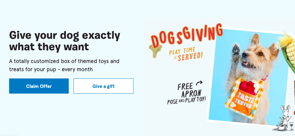
Keeping the subscription box service example, BarkBox sends treats and toys to dog owners, which can be purchased by the owner or given as a gift. On the homepage, we see those two options, enticing owners with a free Thanksgiving-themed dog apron if they buy now.
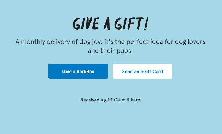
On the gift page, BarkBox uses the top CTA to address obvious pain points holding people back from purchase—price and commitment. Not ready to pay $23 a month for an uncertain number of months for your friend’s pooch? No problem! Send a gift card and leave it up to them.
Testing what works
To get the most out of your CTAs, you have to be willing to test new ideas. Look for those CTAs that are underperforming and seek opportunities for improvement. Select one change to try out and run an A/B test. You will want to choose a variable, such as button color or placement on the page—and test it against a control—most often your existing CTA.
Here are some variables you can try:
- Color
- Placement on page
- Copy
- Images
- Changing form fields
Next, select a timeframe that will give you a clear picture of whether the change has worked by making sure it’s been seen (measured by page views) by enough people to make an informed judgement. This can be as short as two weeks or a few months.
Once the results are in, look at not only the conversions but the conversion rate. Was there an improvement over the control? Look at the quality of the leads generated, too. If it’s a CTA meant to capture people at the end of the buyer’s journey, ask the sales team how many were ready to buy. With this data, only implement what’s working and take away the stuff that isn’t.
For the little, colorful buttons that they are, website CTAs do a lot of heavy lifting for your sales and marketing department. For too long, companies have scattered them across web pages, assuming the more opportunities to click, the better. Marketing research has shown time and again that’s just not a winning approach.
The best way to build a website CTA is to think about it’s placement on the page, what it has to say, and what it’s offering. Consider the design, colors, and whether it’s hard to see. Finally, look to how the overall webpage is guiding users through the buyer’s journey,
With all the work website CTAs do for your business, it’s only fair you put a little work into making those CTAs the best they can be.